I was always fascinated by animation. Growing up I used to create cool flash cartoons and even flash games. Being able to make something move on the screen made me feel like a real magician! Luckily, simple animation could be done in css also without using flash plugins. I would like to share some simple quick ways to get things moving on your web page. You can also check out my portfolio where I used a lot of animation: https://goronkov.dev

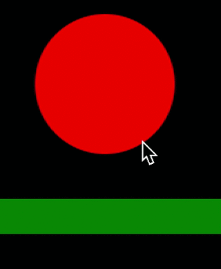
Simple animation can be done using keyframes. In keyframes we can set whatever style you like at any moment of the animation. For example here we have a round <div> that moves down half of the time and move up next half. The coolest thing that every frame in between is filled out automatically, so that the final animation looks very smooth.
In the .ball <div> we have to specify the name for the animation and the duration. You can also set how many time you would like the animation to play by using
animation-iteration-count: number|infinite|initial|inherit;
I have used infinite.

I have lowered the border radius and height to make it look more square when the ball “hits” the floor. The final look looks something like this:
You can play with it more here
Happy coding!
 Web Development Snippets